To be ATS friendly, it’s important that you follow the guidelines, so your clients have the best opportunity to be found and hired by a recruiter. When we started our business 4 years ago, we did 50 hours of research to find which items the algorithms would reject. Since then, we have worked with our network of 2,000 recruiters to define what THEY want to see in a resume. So, before joining our network, we’ll need to see a couple sample resumes.
Once you are a subscriber, we will create a Contributor log in for you. This will allow you to upload content. Please fill out all fields to provide easy, searchable access to recruiters.
- Resumes should be created in a top to bottom layout. No columns, charts, or other special delineations.
- Font should be Calibri or Arial (sans serif), no smaller than 11 pt in black
- No icons, graphs, bubble charts showing competence, headshots, or other illustrative items.
- Demographics should include: address should be (closest major) City, ST, ZIP (no street numbers), phone number, email, and LinkedIn. (Hyperlinked if possible) Please do not use vertical lines ( | ) between items.
- Skills and competencies can be in columns (not tables) or can be delineated by a bullet point like this one: • Do not use vertical lines ( | ) as ATS can misinterpret them. (Remember, this is not a box of Lucky Charms with hearts, stars, rainbows, and unicorns. It’s a business document.)
- Bullet points other than a solid black dot ( • ) can be misread by some algorithms. So, no check marks, stars, empty circles etc. This means, no bullets with sub-bullets under with a different symbol.
- Each resume MUST have a minimum of 4 achievements listed. These will start with past-tense ACTION verbs.
- No shading or solid bars behind text. Again, this type of “coding” can mess up the ATS.
- You must upload your resumes regularly to give your client the best value
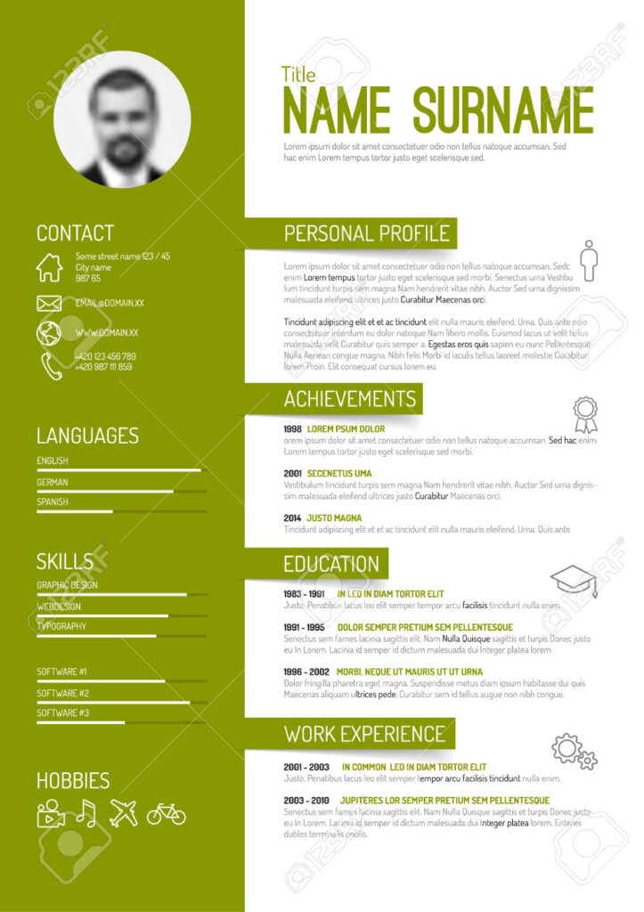
What do we want? Definitely not this!
- Photo – not in USA
- Columns – might look nice but won’t read properly in ATS
- Borders – see above
- Colors – see above
- Summary heading – recruiters are smart enough to know what it is
- Job title??
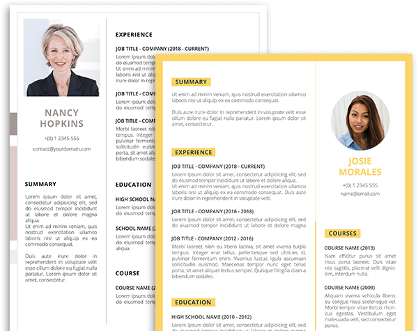
Or this . . .
- Photo – wasted space
- Icons – Not needed
- Skills ratings – recruiters don’t want to decipher this
- Hobbies – No!
- Color – NO
- Columns – NO
- Name – Reduce size
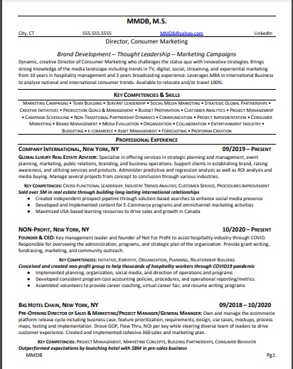
Definitely something like this!
- Name with degree if higher than BA
- City, ST, Phone, Hyperlinked email and LinkedIn
- Scans top to bottom
- Maximum 3 bullets in a row
- Lots of white space
- Dates properly formatted
- ACHIEVEMENTS!
- Goes to 2 pages
- Education at the bottom (unless fresh grad)
- Narrow margins